Lea Johanna Becker
nomo mono Lea Johanna Becker – A monospace font with a variable width.
No items found.
nomomono
210 × 297 mm
Dec 2023
academic research project
editorial
research
text
typography

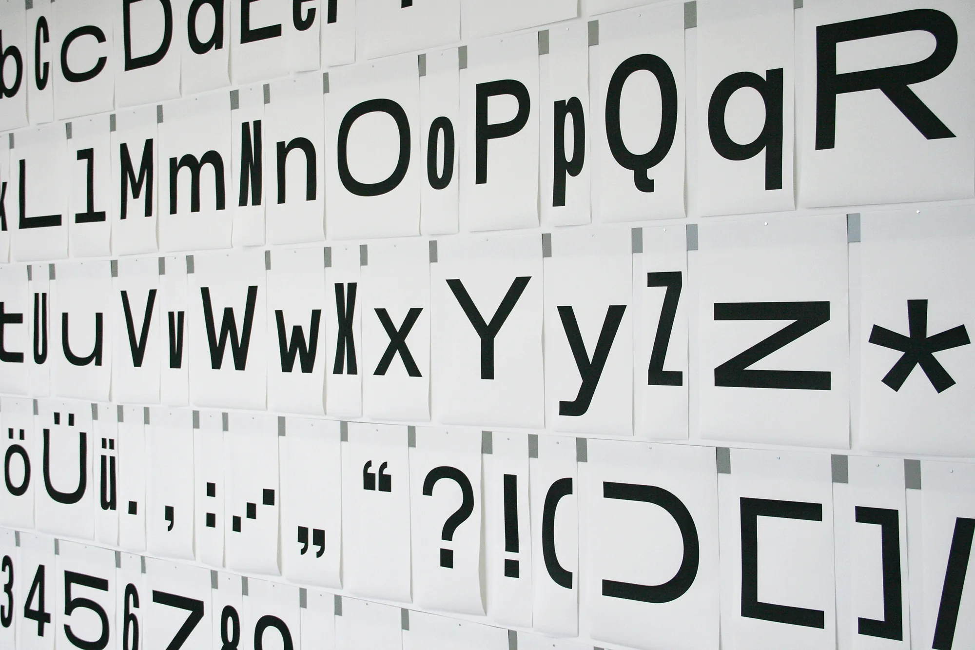
nomo is a monospace font with variable advance width. The narrowest style is 300, the widest 900 units wide, the whole spectrum possible. This translates to the font being of the same weight within a style (mono), but in total different along this width (nomo).

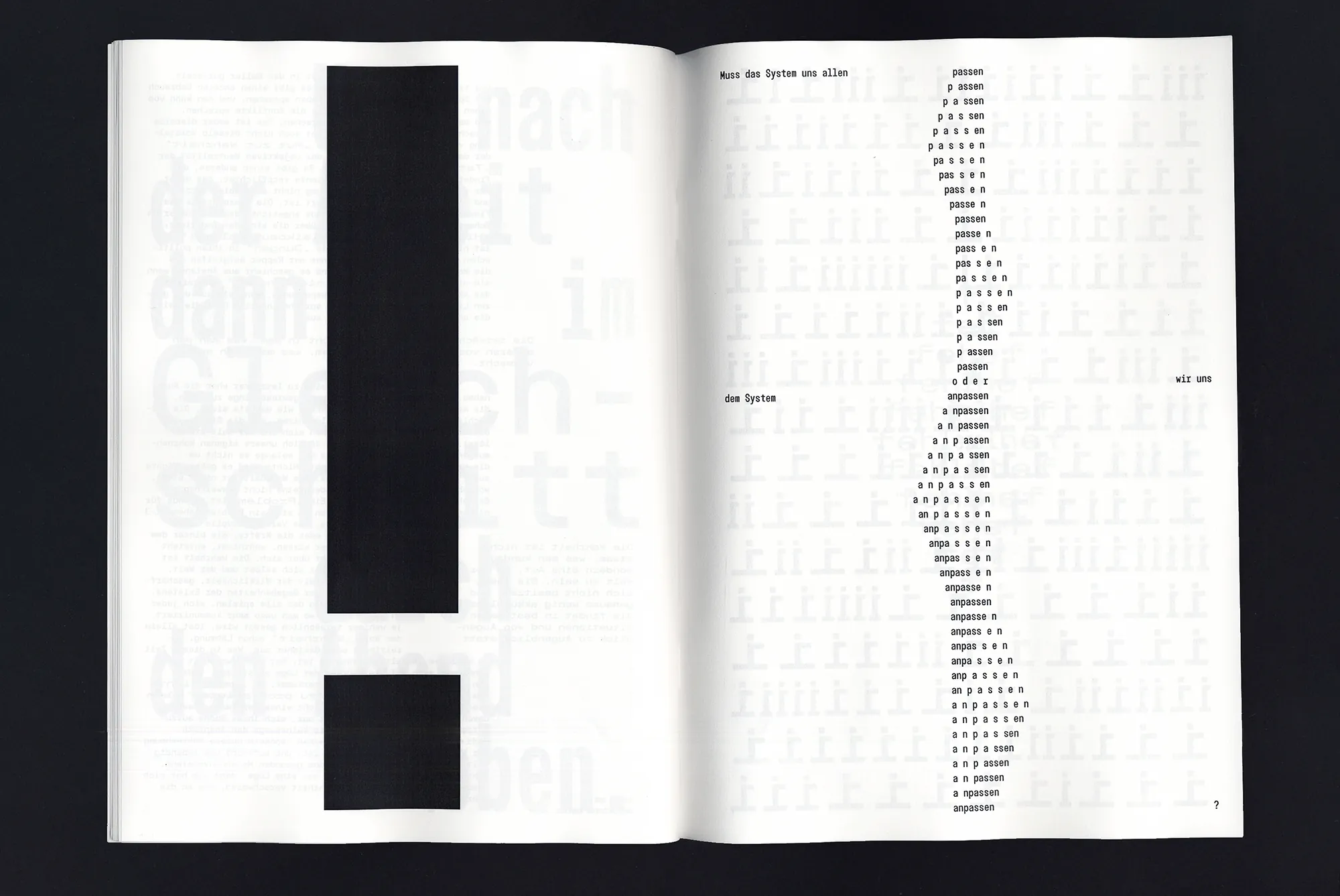
This characteristic makes it possible to pursue topics not only in terms of content, but also in their form, to examine different questions. In the design of the font, but also through designing with the font.

To scrutinise means to uncover that certain structures do not depict a reality, but rather create a reality. The result of these discussions and experiments is collected in a zine which shows, that it is worth questioning the given, being stubborn and that this can lead to a new, fluid approach to strict and rigid systems.

Who does a system suit and who suits the system? Are equality and justice even related? Which characters can show character? What happens to the big picture when individuals step out of line? And when does it begin to totter when many join forces? Is there still a structure at all if the thing that it wants to structure is stubborn and non-conformist? What does it mean to occupy space and break through its boundaries? How can we recognize, strengthen and show the beauty in disobedience?